We have a lot of biology data out there. While not enough to train AIs to solve all of biology, a large amount of insight is waiting to be discovered in the data we already have. But often, our tools show us exactly what we are looking for, limiting our ability to discover unknown unknowns through open-ended data exploration.
This was the feeling we had reading the recent paper from Baker’s Lab on their protein-protein interaction (PPI) dataset. The dataset contains predictions for over 200m potential PPIs, generated using their model (named RF2-PPI) with confidence scores fromAlphaFold 2, earning the prediction pipeline the shortened name RF2/AF2. At 90% precision level, the model predicted 17,849 PPIs, including 3,631 new PPIs that have not been previously identified in previous experimental screens. How can we explore this huge dataset, if what we are looking for is an unknown unknown?
Fortunately, PPIs are a relatively simple type of data: it’s a graph! Each entry includes two columns: protein 1 and protein 2, indicating these two proteins interact. So during the Hackathon at LBF7 in Valencia, our team (Alex, Cat, Faizan and Tom) built a tool to visualize this dataset.
But first, what do we already know about protein-protein interactions?
Proteins perform their function by forming physical contacts with other proteins. Sometimes this contact is fleeting during signaling; other times they form stable complexes that carry out cellular functions. If we know which proteins interact with each other, we can deduce how pathways and structures come together.
Most of what we know about PPIs comes from experimental screens. Over the years, thousands of such studies have been aggregated into large curated databases like BioGRID or STRING, where curators annotate each interaction and evaluate the strength of evidence. These experimental databases have become valuable references for biological research.
Still, they are far from perfect. These screens create lab controlled environments that allow us to detect whether two proteins bind to each other. But these methods also introduce considerable false positives and false negatives. False positives can be caused by proteins binding to experimental artifacts, while false negatives by interactions that are indetectible because they're too fleeting or condition-specific.
In total, current databases contain 1m PPIs, of which 900k are believed to be false positives.
RF2/AF2 expands the scope of evidence beyond empirical observations. The training started with experimental data from the Protein Data Bank, which was then augmented with a few clever ideas, including a secondary dataset generated from the AlphaFold Protein Structure Database – a database containing predicted protein structures by AlphaFold. High-confidence predictions by RF2-PPI had their 3D structures generated by AlphaFold 2 to verify that they plausibly interact.
From this came a large number of new, high-confidence interactions. We created a visualization for this 80% confidence dataset; perhaps this could unveil unknown unknowns about cell biology!
The Visualization
Each protein is represented as a node in the graph. The size and centrality of a node are determined by the number of interactions the protein has.
Node coloring conveys information about novelty.
The darker the blue, the higher the number of new interactions.
Edges are predicted interactions and are also color coded.
Hovering or clicking on a node reveals its immediate (first-degree) connections. If two first-degree connections are also connected to each other, this is called an interconnection and is also shown.
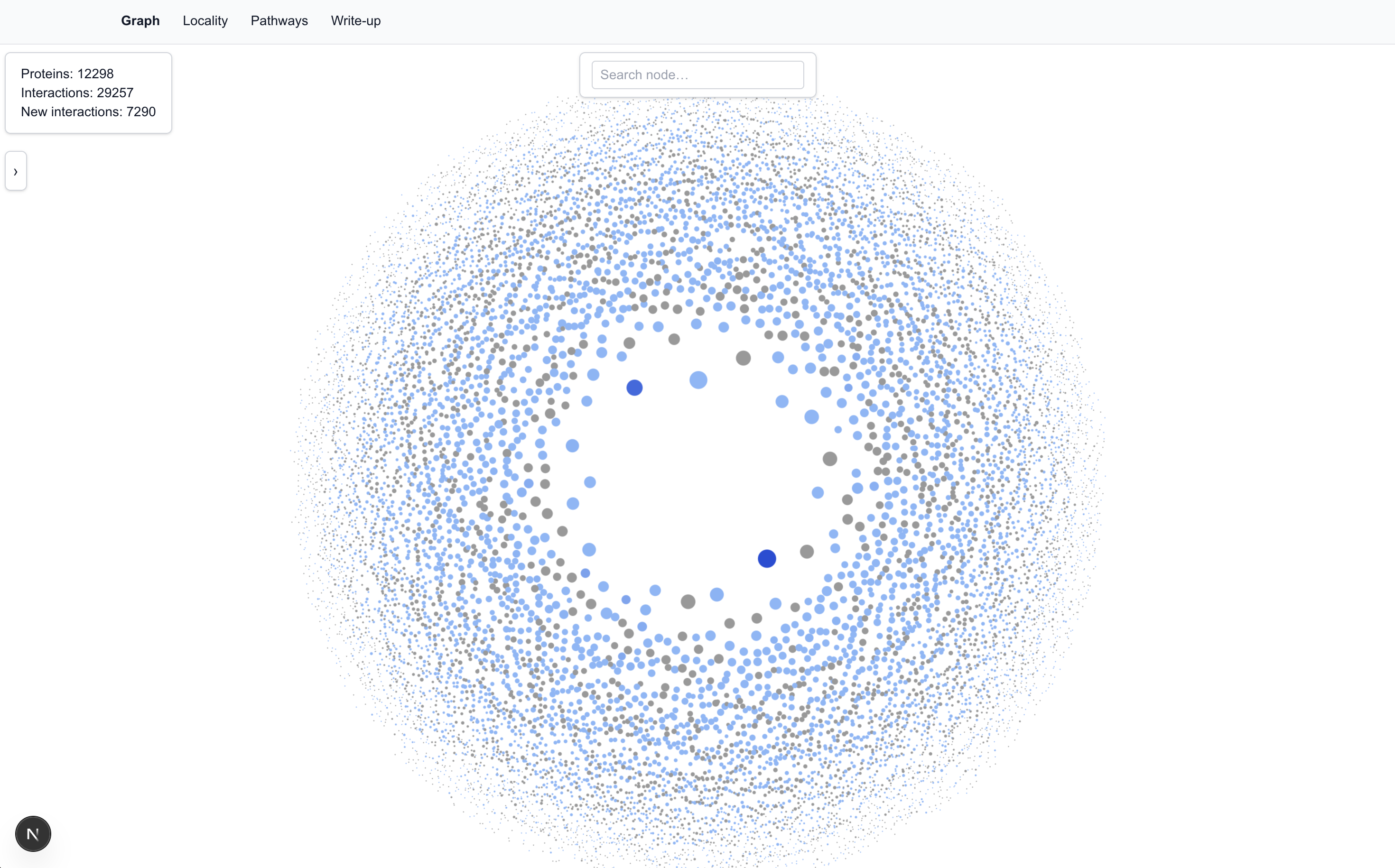
We populated the tool with the 80% precision dataset, which has: 12,298 proteins; 29,257 interactions; 7,290 of which are new interactions.
The Graph View
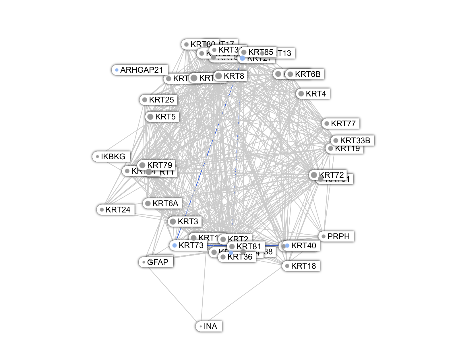
IGLL1 and IGLL5
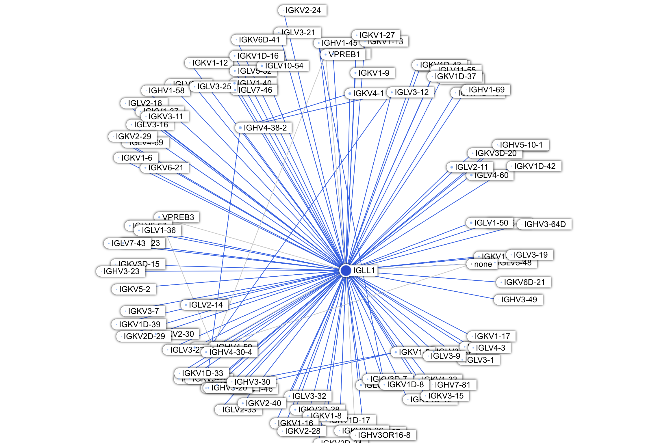
Immediately noticeable from the Graph view are two dark blue proteins:IGLL1(Immunoglobulin Lambda Like Polypeptide 1) andIGLL5(Immunoglobulin Lambda Like Polypeptide 5). These two proteins are located in the center (meaning they have many interactions) and are dark blue (many of their interactions are new to us). The paper stated that new interactions are enriched in the immune system proteins category (263 new PPIs total); from the Graph view we can see that majority concentrate on these two proteins (171 PPIs combined).
With so many previously unknown interactions, might this be a significant discovery? Unfortunately, this seems unlikely.
First, let's talk about IGLL1 and its role in the immune system. B cells contain a structurally diverse light chain, which interfaces with an even more structurally diverse heavy chain. The different structures of the light and heavy chains are what allow for a wide range of antibody shapes and functions. Candidate B cells are created by first selecting a heavy chain from random heavy chain arrangements, followed by selecting a light chain from random light chain arrangements. The successful B cells are then allowed to proliferate. Before it finds a successful arrangement, the system wants to conserve resources and not make more cell components than it needs to. So it tests different heavy chain arrangements on a "fake" light chain, called a surrogate light chain, which later is replaced by different candidate light chains. This surrogate light chain contains only two proteins. IGLL1 is one of the two proteins, and it contains the region of this surrogate light chain that interfaces with candidate heavy chains.
So we can see why IGLL1 has so many new interactions: they are all with heavy chain and light chain proteins!
IGHVs are the V domain of heavy chains, which, despite being variable, all include the structural interface with the surrogate light chain (specifically, with IGLL1). So the various new IGHV interaction partners are likely correct, but not particularly insightful.
IGKVs and IGLVs are part of the "real" light chain. While it is plausible, even likely, that the surrogate light chain's IGLL1 is structurally interactible with these proteins, the likelihood of IGLL1 being colocated with these real light chain proteins are low based on our current understanding of B cell development. Once a heavy chain is selected, the surrogate light chain is degraded before the candidate light chain creation process begins. Therefore IGLL1 and conventional light chain proteins are not expected to be present in the same cell at the same time and we should treat these new interactions with a lot of skepticism.
What about IGLL5?
The first thing to note is that IGLL5 is an IGLL1 paralog; they share sequence and structural similarities. We expect, and do observe, that they share a considerable number of predicted interaction partners.
Beyond that, the role of IGLL5 is not well understood. It is not part of the canonical light chain assembly (even though it's structural compatible). It is more known in be altered or abnormally expressed in cancer, of both B cells or other types of tumors. It could be possible that the dense network of new interactions between IGLL5 and the light and heavy chain proteins suggest something novel about how cancer rewires antibody pathways. But the combination of the facts that: IGLL5 is an IGLL1 paralog, many of IGLL1's new interactions are developmentally implausible, and many of such interaction partners are shared between IGLL5 and IGLL1 -- all suggest a strong prior that these new predictions are more driven by structural compatibility and do not reflect bona fide interactions.
To conclude this discussion: unfortunately we have not successfully gained any insights here. It is not surprising that IGLL1 and IGLL5 can, in principle, interact with light and heavy chain proteins. Whether these interactions actually occur, at a meaningful level in cells, is a knowledge gap we are unlikely to fill with protein interaction data.
Hub vs. Clique Topology
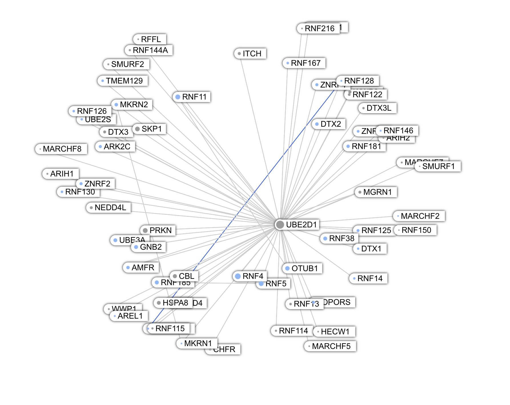
Graph analyses have been done extensively on PPI networks to uncover pathways, modules and major hubs. We can visually identify some of those major hubs and cliques from our Graph view.
Among the largest nodes are UBE2D1, UBE2D2, UBE2D3 -- conjugating enzymes involved in protein degradation. These proteins are paralogs and share a large number of interactions.
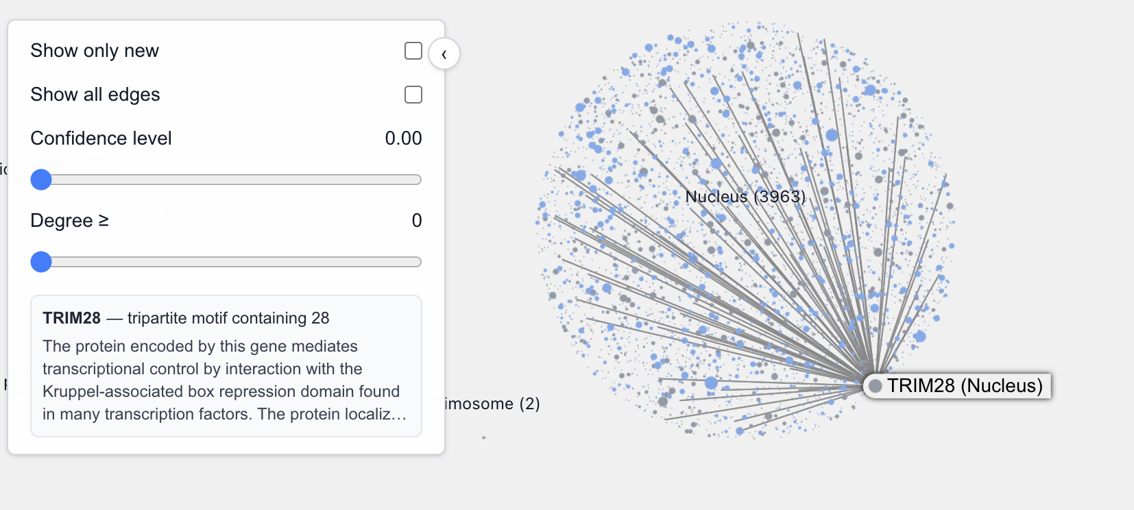
Another such protein is TRIM28, located in the nucleus. This is what GPT5 told me about TRIM28:
TRIM28 (also known as KAP1, TIF1β, or KRAB-associated protein 1) is one of the most fascinating and multifunctional proteins in mammalian cells.It’s a master transcriptional co-repressor, a chromatin organizer, and a genome stability guardian — especially important in stem cells, early embryos, and virus/retrotransposon silencing.
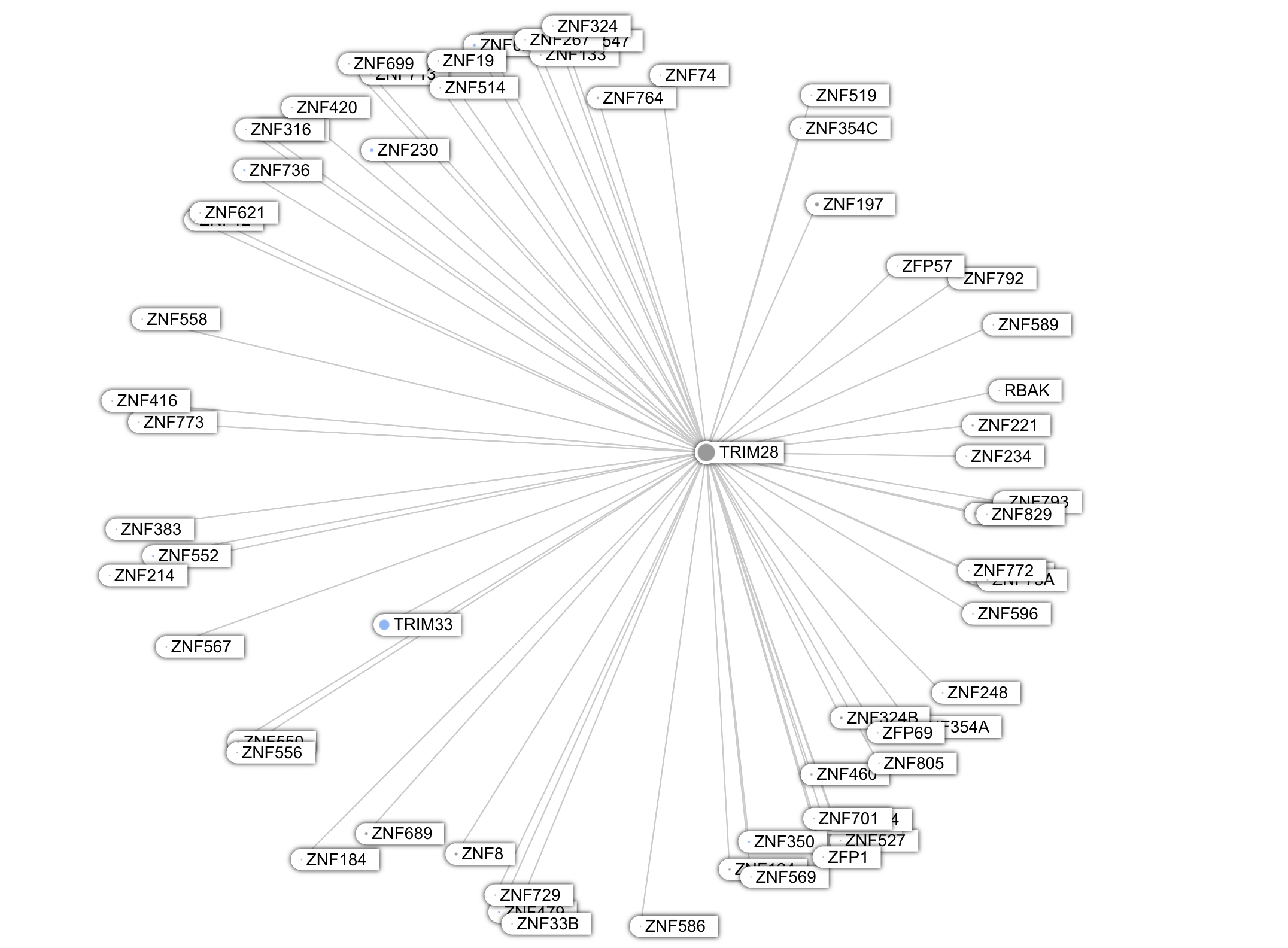
Unlike these proteins, whose graph looks star-shaped, the Keratins are deeply embedded in a highly interconnected network, i.e a clique topology.
The Locality View
It's quickly apparent that to evaluate the new predicted interactions, we need more contextual knowledge. One context we thought would be insightful to add is the location of the proteins in the cell. So the Locality view was created.
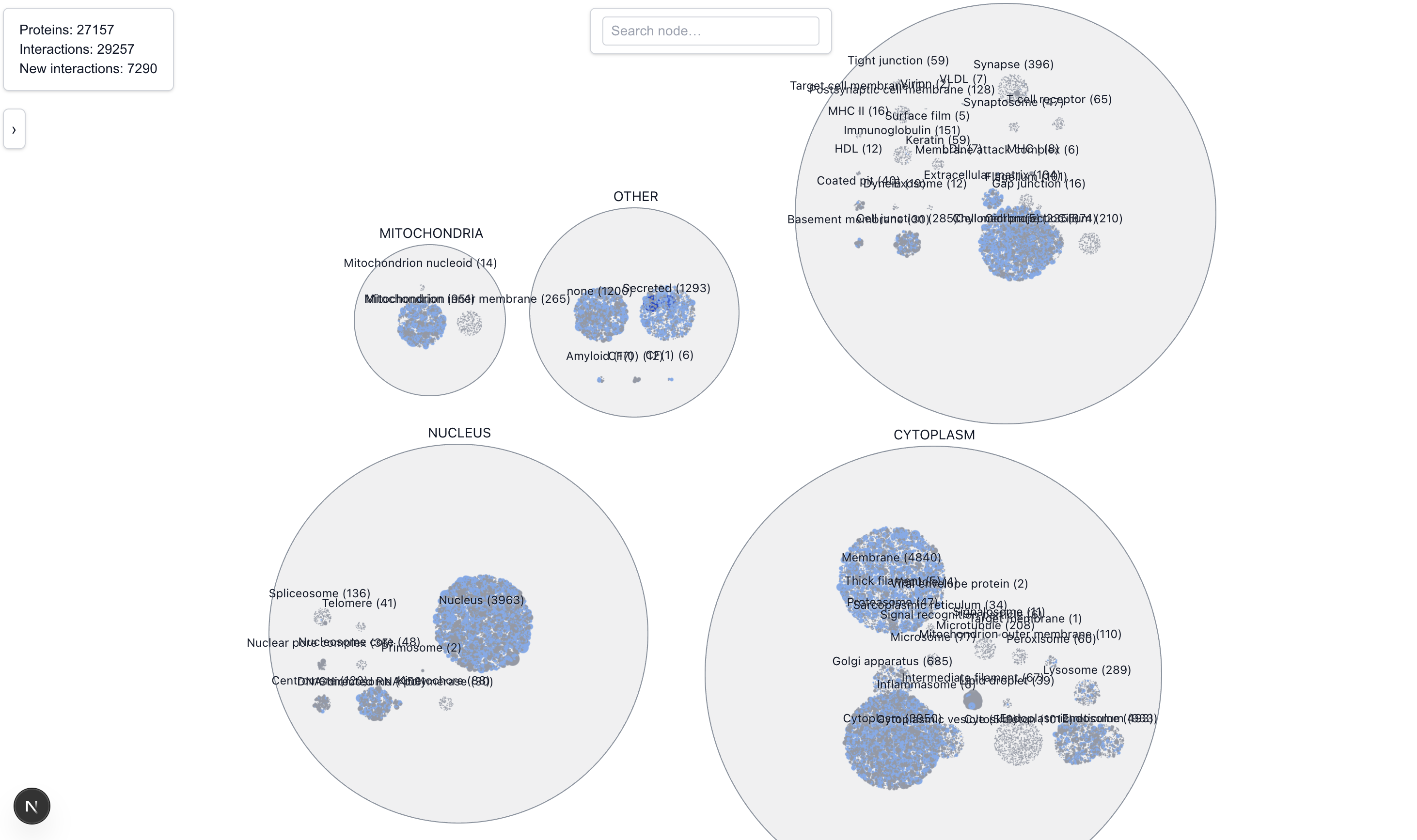
The Locality View clusters proteins based on their location. Locations are broadly grouped into five main categories: Cytoplasm, Nucleus, Mitochondria, and Extra Cellular. During the exercising of classifying locations into one of these 5 categories, we noted several ambiguities:
- Since most proteins are active in more than one location, each (protein, location) pair is represented separately in this view. On hover or focus, the graph will connect to the instance of the connected protein in the same location first, and will only connect to an instance in a different location if none is found. If there are several suitable locations, it picks the first one it sees.
- It’s unclear whether “Cell Membrane” should belong in the Cytoplasm group or the Extra Cellular group. For now it’s located in Extra Cellular
- There’s also a “Membrane” location that appears to be all encompassing of cell membrane, organelle membrane, nuclear membrane,etc. For now it’s located in the Cytoplasm bucket; but note that depending on which membrane the protein is located, it might not be in the cytoplasm at all
- The “none” category was placed under Other, along with CF(0) and CF(1) because we couldn’t figure out what they meant at the time of classification. On closer inspection, they appear to be all ATP related and perhaps should be in the Mitochondria group
- Also under Other is the Amyloid category, which we suspected to be proteins found on Amyloid plaques and should be extra cellular but we weren’t sure
- The “Secreted” category should be under Extra Cellular but was mistakenly placed under Other (oops)
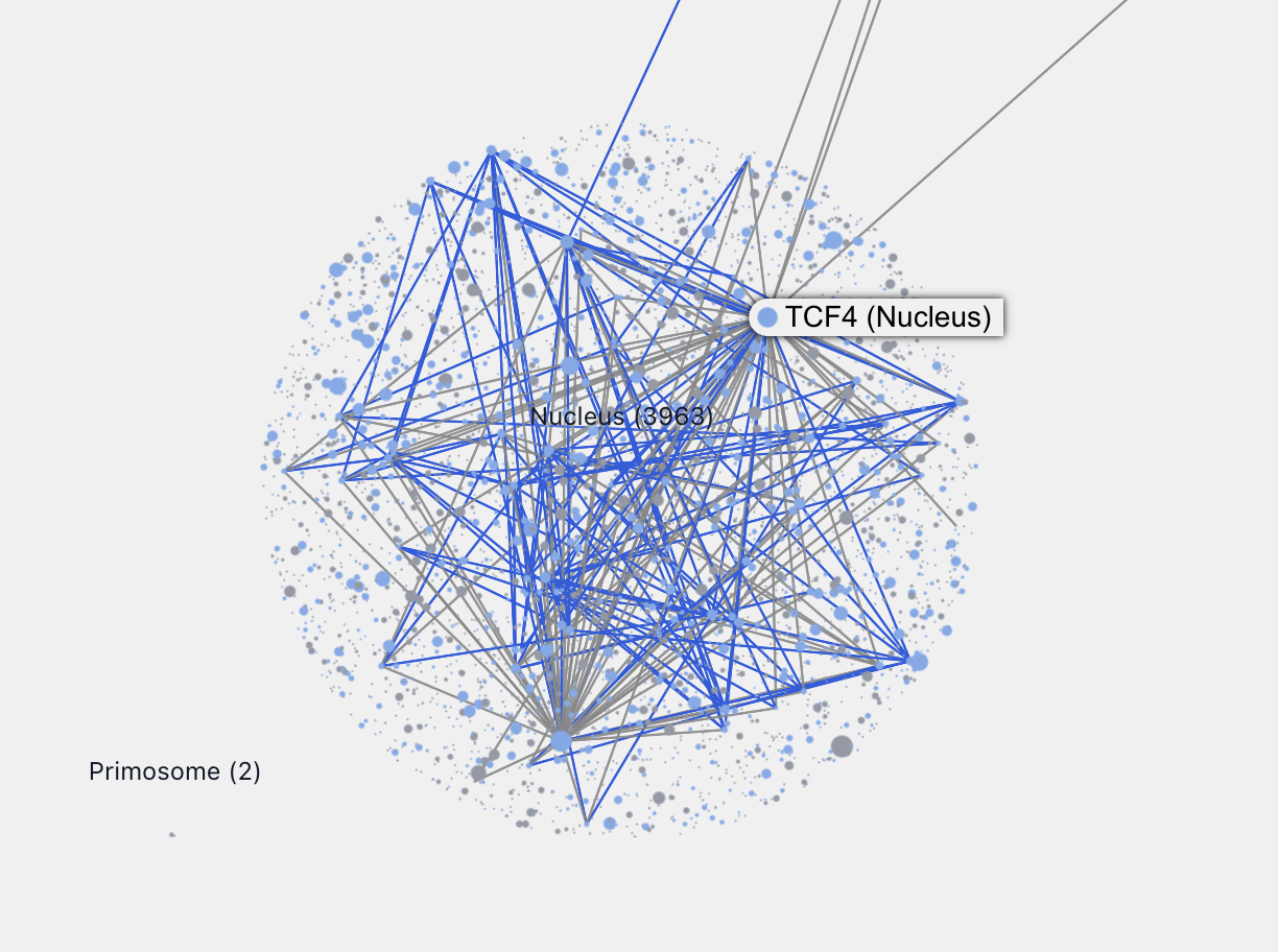
Zooming into each location allows us to see, by relative sizes, the major connecting proteins in that location. For example, zooming into the nucleus we can easily identify these major proteins.
Characterizing Less-Understood Proteins
From the paper:
These observations support the high accuracy of our predictions and suggest that they can be used to infer the functions and subcellular localizations of poorly characterized proteins by linking them to well-annotated interaction partners.
We took a look at a few interesting proteins from the “none” cluster but struggled to derive something truly novel. One issue is annotation accuracy. Many proteins whose location is "none" in the Baker’s prediction set already have a presumed location or well-understood interaction partners from BIOGRID.
Some new predicted interactions we investigated from the "none" cluster look plausible, but we lack the knowledge and contextualize them:
- SAMD12 (a transmembrane protein) and CNKSR1/2/3, all related to the EGFR-RAS-ERK signaling pathway
- HPCAL4 and ADAM11/ADAM23, all related to synaptic membrane
An interesting pattern is proteins with known interaction partners in one cellular locations, and many new predicted interaction partners clustered in another location. The fact that the new interaction partners are colocated makes these prediction, at least in our view, more credible. One such protein is SOS1.
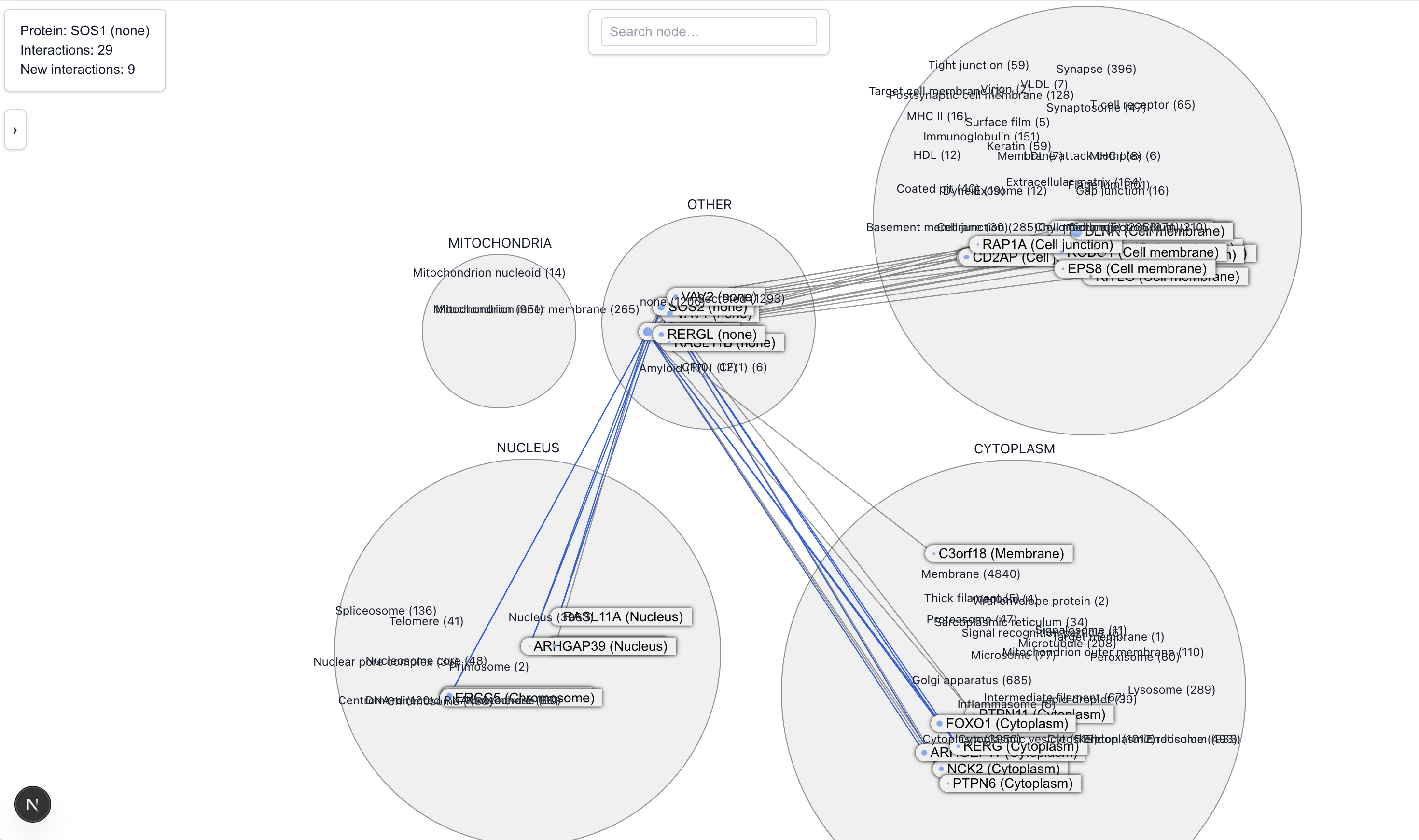
SOS is known to help activate RAS, a protein that tells cells when to grow and divide. It does this at the cell’s outer surface, near the membrane. We see this represented in the Locality view by the cluster of known interactions between SOS1 and cell membrane proteins. Notably, there's also a newly predicted cluster of interactions with proteins in the nucleus, where reports of SOS1 activites are uncommon. This led us to do some further research and find a limited number of reports of SOS1’s transient activities near or in the nucleus under stressful situations.
Of all the new predicted interactors, only BRD8 has been identified via an affinity capture screen. So it's hard to say, there might be something to be discovered here. We can hope that by investigating the remaining new predictions, new hypotheses can be fomred about SOS1's role around the nucleus.
Uncharacterized Proteins
What about proteins that are not just poorly understood, but completely uncharacterized? We identified these proteins by looking for the location code, LOC.
LOC128125818 is an uncharacterized protein located in the membrane.
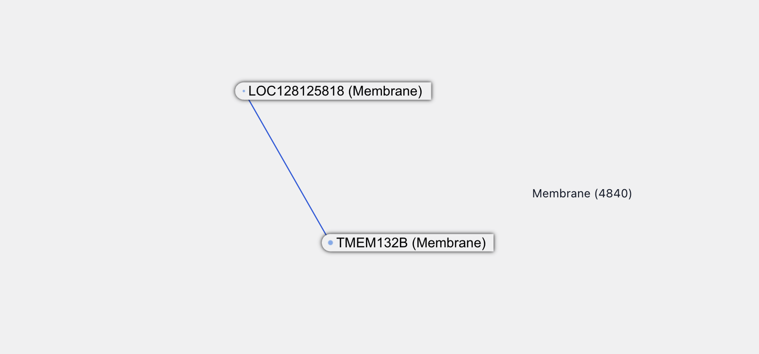
There is one new predicted interaction partner for it, a protein called TMEM132B, which is a transmembrane protein -- a class of protein called out by the paper as difficult to screen for interactions experimentally. Not much is known about TMEM132B: it’s likely located on the membrane and is enriched in neurons and synaptic functions.
TMEM132B itself also has some new interactions, all at over 90% confidence.
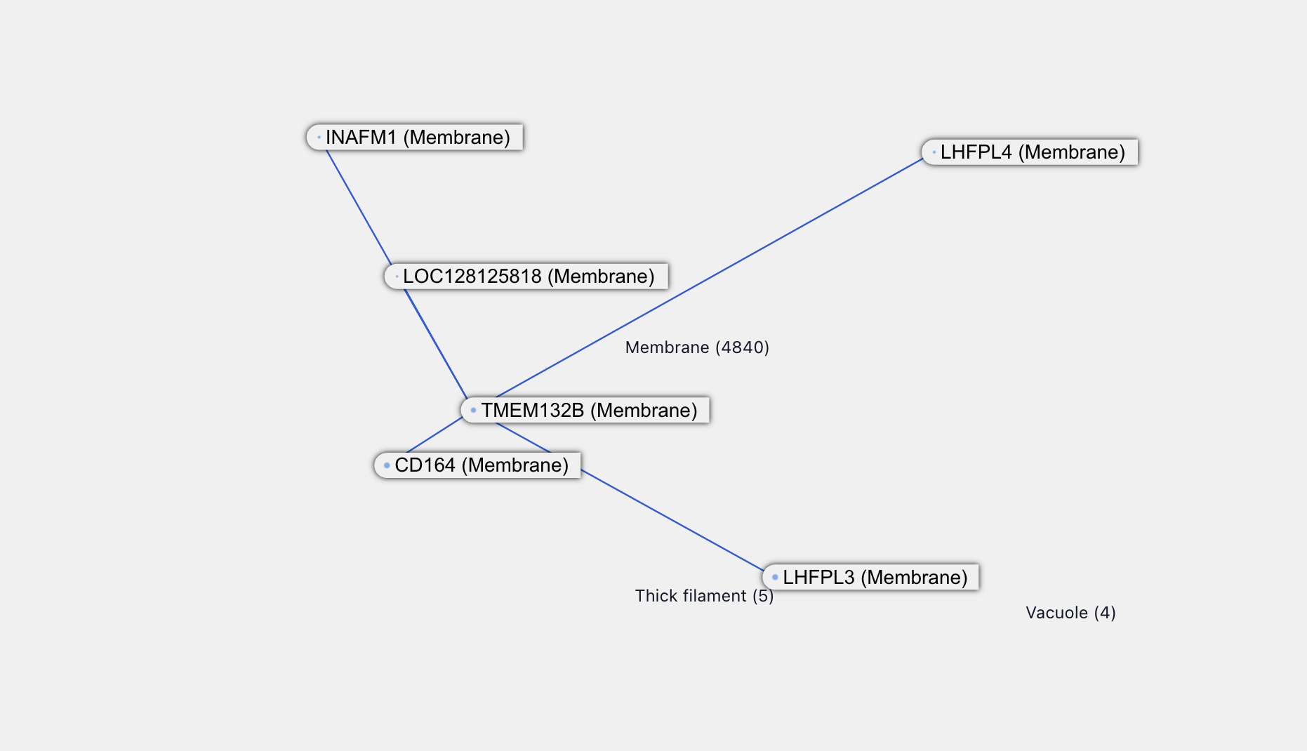
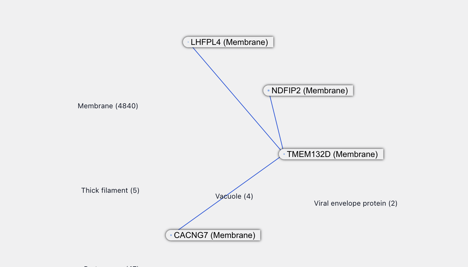
LHFPL4 is associated with inhibitory synaptic functions and itself has a new interaction with TMEM132D. This is also a transmembrane protein and, from the naming, probably associated with TMEM132B. All of this supports the credibility of the TMEM132B - LHFPL4 interaction.
Among other proteins purported to interact with TMEM132B, LHFPL3 sounds related to LHFPL4, while CD164 and INAFM1 are both poorly uncharacterized proteins. CD164 is reported to be upregulated in certain cancers.
We will stop here because, while all this is very interesting, we lack the relevant expertise to say anything meaningful about it. It does feel like there’s something here in this cluster of poorly characterized, newly-connected proteins – maybe a future pathway or mechanism to be discovered!
Transcription Factor Topology
PPI graph analyses have been used to identify transcription factor complexes. Complex identification is difficult todo visually, looking at one protein graph at a time, but we did train our inner neural network on a related game called "Transcription Factor or not?" We talked ourselves into believing that there’s a graph network topological disposition for transcription factors: they have a very high interconnections to connections ratio
For example, these are transcription factors (DNA-binding) or a TF subunit:
On the other hand, these are not transcription factors (although they may still be involved in transcription regulation):
There are exceptions too of course. For example, these aren’t TFs:
And for the fall negative case, this is a TF:
The Pathway View
The next step after [AlphaFold] would be modeling .. a whole pathway maybe like the TOR pathway. ” - Demis Hassabis
Our Hackathon project took inspiration from the predicting biological pathways use case. We evaluated how well the RF/AF2 predictions cover the mTOR pathway (spoiler: not that well). This inspired our third visualization idea: visualizing pathways as part of the bigger graph.
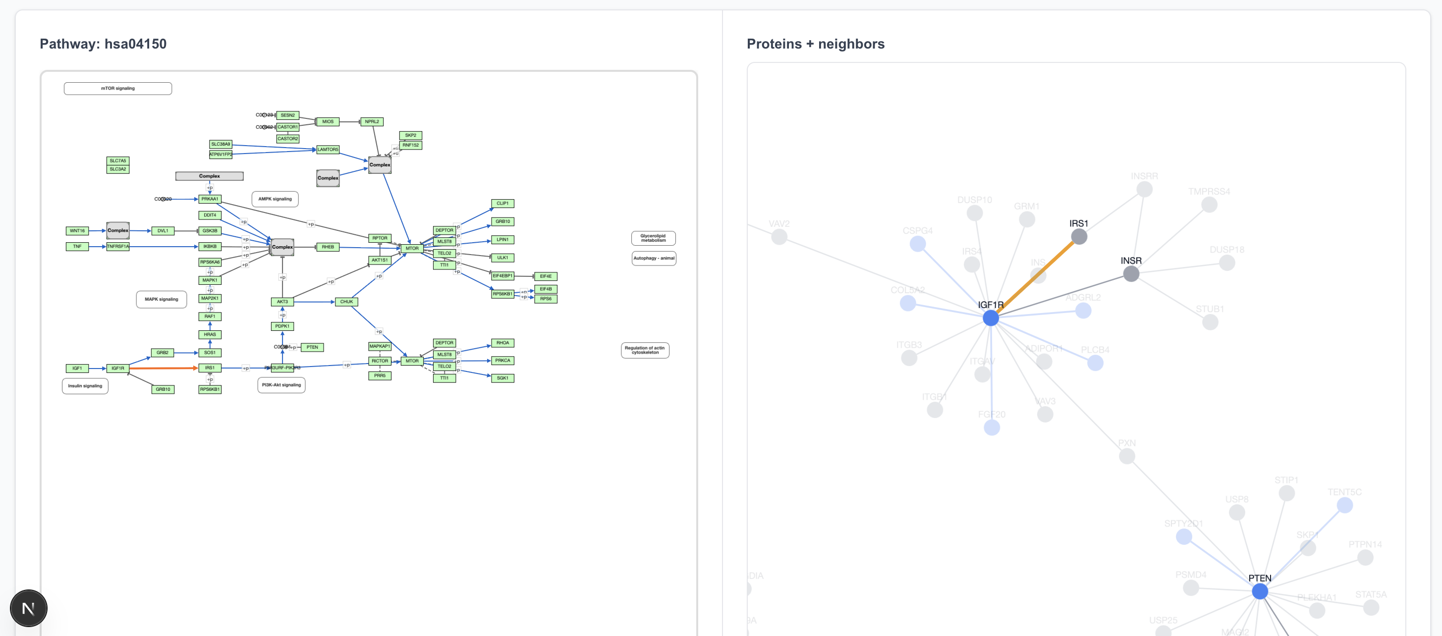
Our Pathway View queries the KEGG database as a source for pathway data. Selecting a pathway (using mTOR as the example) displays a chart on the left and a corresponding graph on the right.
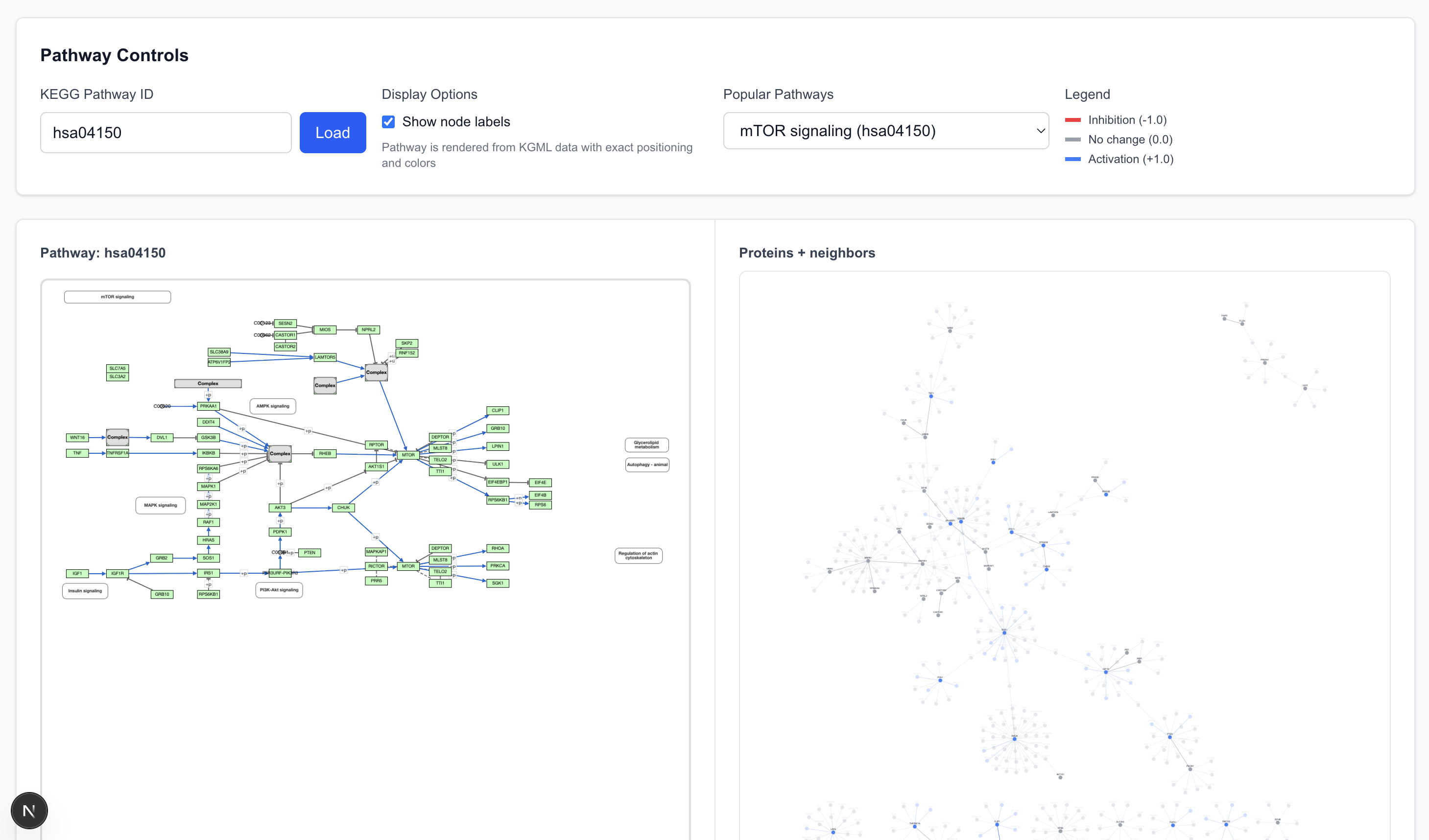
- Elements (nodes and edges) in the pathway are shown with 100% opacity.
- Elements with low opacity are adjacent to the pathway (first-degree connections) but not explicitly parts of the defined pathway chart.
- The graph allows cross-referencing: selecting a protein or arrow on the pathway chart highlights the corresponding element in the graph view, and vice versa.
Examining the mTOR pathway reveals interesting details.
The graph view comprises of many graph “islands”. RF2/AF2, at 80% confidence, did not predict the interactions that connect these islands together. In fact, the namesake protein, MTOR, including its aliases, is not present in the graph at all because the model predicted no interaction between MTOR and other proteins.
The pathway begins with IGF1 → IGF1R. The only interaction partner for IGF1 in the 80% precision dataset is IGFALS, so clicking on IGF1 on the pathway view shows an IGF1 island, disconnected from IGF1R.
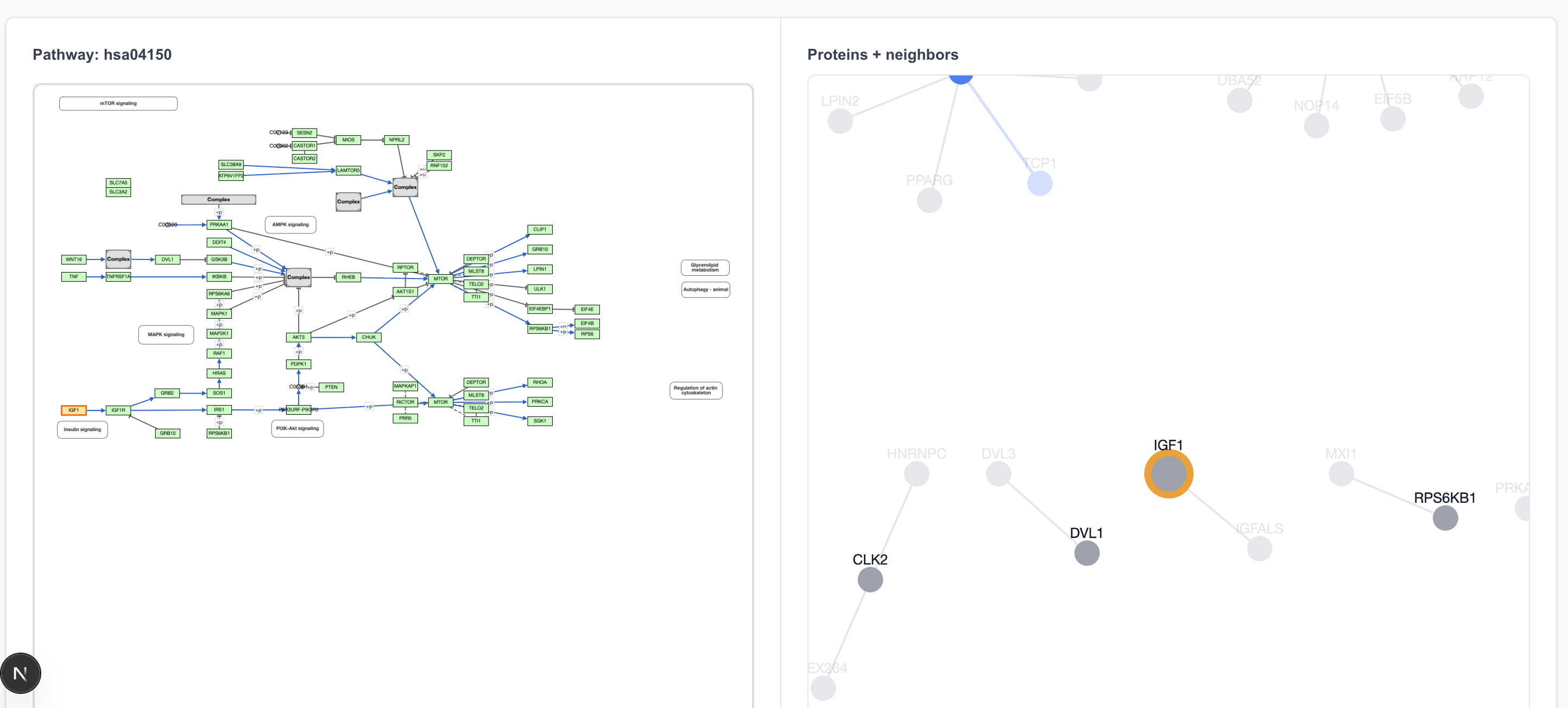
Clicking on IGF1R highlights two proteins on the graph view: IGF1R and INS. That’s because the “IGF1R” box in the pathway drawing refers to both of these proteins.
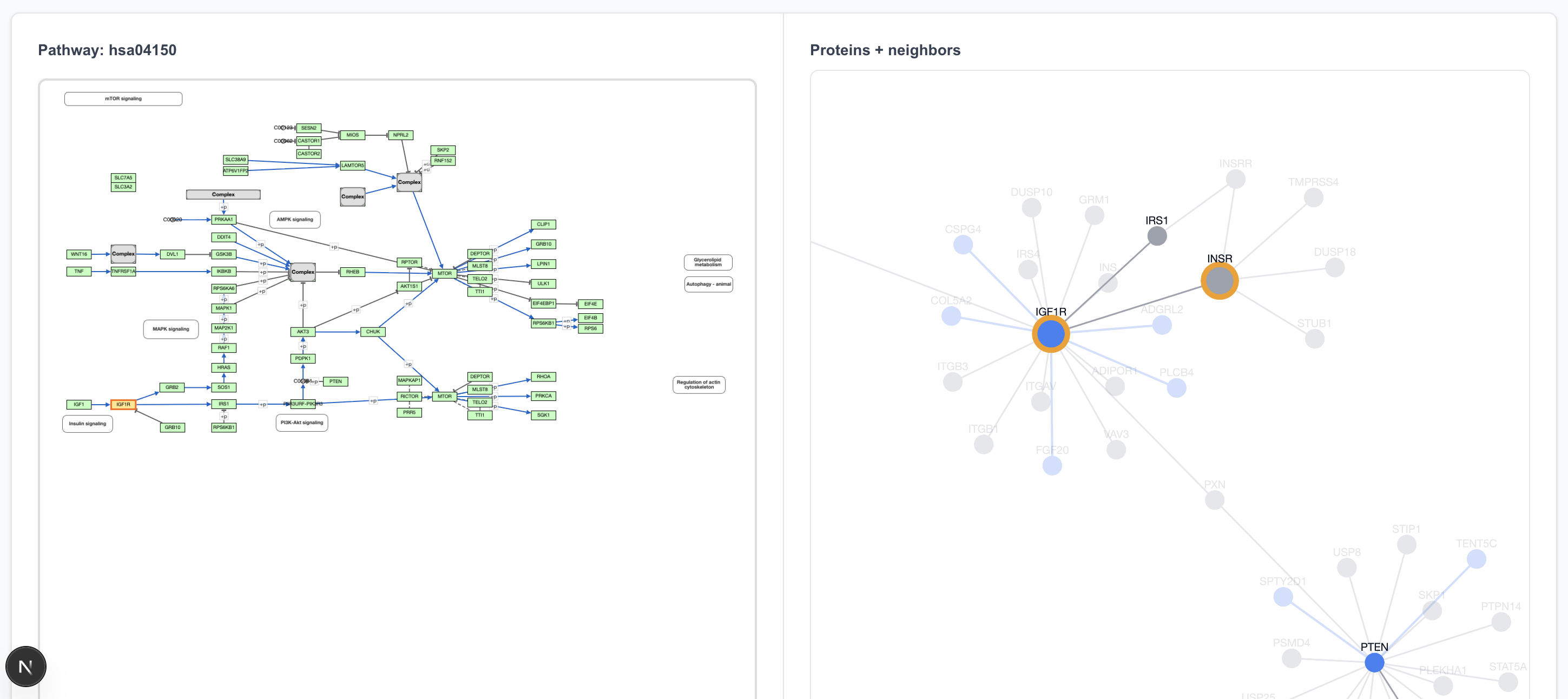
The IGF1R → IRS1 connection is in the 80% precision predicted dataset, and clicking on that arrow does highlight it in the graph view.
A particularly cool feature of the graph view is seeing what lies outside the pathway boundaries. For instance, IGF1R interacts not only with the next step in the pathway but also with transparent-colored proteins around it, many of which are new (blue) interactions.
The graph also highlights details not discernible in the pathway view. While each step in the pathway view appears equal, a quick scan of the graph view informs us which proteins have more external influence than others. We can see, for example, that RHOA, while just one of the many steps at the end, acts as an interaction hub outside of this MTOR pathway.
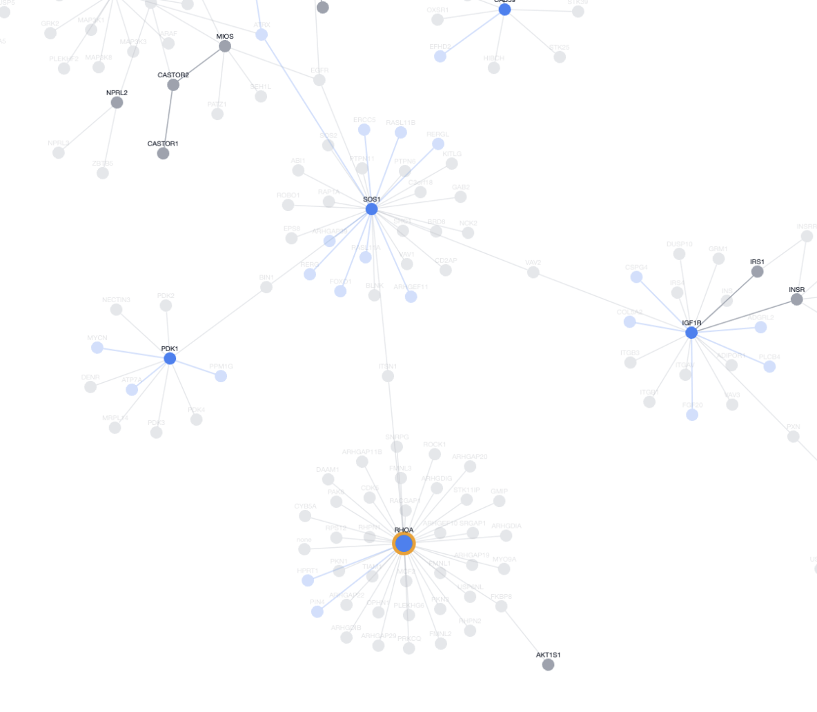
This zoomed out view put elements of the pathway into a larger context, showing how they plug into the rest of the cell rather than acting in isolation. Seeing these external links helps prioritize targets: perturbing a hub like RHOA might influence multiple pathways (cancer migration, MTOR regulation), driving unexpected discoveries or off-target drug effects. Local nodes, on the other hand, have narrower impacts due to limited pathway crosstalk.
Next Steps
This blog post only introduces the visualization tools and offers a preliminary examination of the data. There are quite a few things we wanted to do but couldn’t get to during the Hackathon weekend:
Pathway Coverage
A pathway coverage feature would highlight in green and red which interactions are or are not in the dataset, so we can determine how well the dataset covers interactions in the known pathway. This functionality was the initial motivation for the pathway exploration at the hackathon.
That said, a few disclaimers here are warranted. PPI data only shows us the possibility for interactions. It does not tell us anything about causation. The concept of “pathways” are artificially defined by us to delineate some cause and effect in protein interactions. Even if a PPI model predicted all interactions in the mTOR pathway, would it be able to separate those specific ones from all possible interactions involving these proteins, and present it to us as a “pathway”? We have doubts that this is currently possible.
Interactions between proteins depend not only on the proteins involved, but also on external environmental factors such as colocating possibility, protein concentration, or the right PH environment. For a model to hypothesize a pathway with reasonable accuracy, its data will need to be supplemented with these additional factors.
Importing Other Datasets
The visualization currently uses a restricted dataset (about 30k interactions) for ease of rendering. The next logical step is to load the entire 44 million (M) pair dataset predicted by RF2-PPI and allow users to dynamically select the desired confidence level. We can also expand to other sources of PPI data like BioGRID or Uniprot to allow cross-dataset comparison.
Pathfinding
Given protein A and protein B, find all paths connecting A and B under k steps. We lack the scientific experience to articulate how exactly this would be useful, but it makes intuitive sense for a graph network.
Clustering / Modularity Analysis
Clustering analyses have been used on experimental PPI dataset to identify complexes, regulating network, and densely connected modules. We are curious to see if applyin similar techniques to the RF2-PPI prediction dataset will identify novel clusters or modules.
Conclusion
As we explored the visualized dataset, trying to find novel insights, one thing became apparent: many predictions are intriguing, but specialized scientific expertise is needed to evaluate, interpret and contextualize them. Unfortunately, there exists a gap between scientists with the relevant expertise and engineers who study PPIs at the graph network level. We hope that this visualization tool can contribute to bridging this gap, by providing a easy starting point for investigation.
Explore the data on your own
Explore the data at https://lbf7-best-team.vercel.app/. A few notes:
- This app is Hackathon quality, vibecoded, and hasn’t been touched since the Hackathon. As such there are many bugs, apologies
- Graph page: The protein and interaction counts at the top left are correct at confidence level 0. It’s buggy when changing the confidence level, don’t trust it
- Pathways page: There’s a known bug when switching pathways a few times. The graphs accumulate between switches and become really big. When that happens just refresh the page
- Clicking on the node label (with the protein name) should work, but does not always work. To be safe, click on the blue / gray dot itself